Analysis Tools
Analysis tools
Transfer
Find genes that have certain relationship based on interaction, position or mapping with the selected genes and display them in a table.
Based on interaction - PPI
Introduction:
Predict interaction relationship between proteins. Find genes/transcripts/proteins that may have interaction relationship with the selected data.
Database:
Prediction is based on STRING11 and the transcript mapping relationship of the NCBI reference.
- STRING11: https://string-db.org/cgi/download.pl?sessionId=esF2YhHLpzd0
- NCBI Reference: https://www.ncbi.nlm.nih.gov/
Parameters:
- Min score: From 0 to 1000. The higher the score is, the more reliable the prediction is. The default min score is 500.
- Max num: The maximum number of genes/transcripts/proteins that can be called.
- Limit: set the maximum number.
- No limit: don’t have to set the maximum number.
Example:
First row shows the original genes/transcripts/proteins you selected. Genes/transcripts/proteins that have PPI relationship with the original data are shown in the first column. In the table, ‘1’ represents the corresponding data have PPI relationship, ‘0’ represents they don’t. Dr. Tom system displays 20 genes/transcripts/proteins in the first row by default. If there are more than 20 genes/transcripts/proteins, you can download the table to check the hidden part.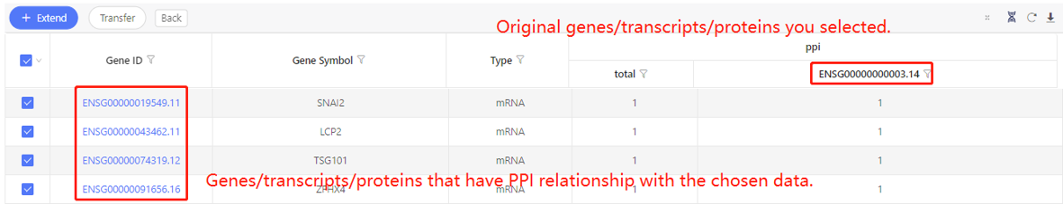
Based on interaction – Target
Introduction:
Predict target relationship between microRNA and mRNA/lncRNA/circRNA.
Prediction database/software:
Target relationship between microRNA and circRNA are obtained from Starbase.
Target relationship between microRNA and mRNA/lncRNA.
For animals, we use TargetScan, RNAhybrid and miRanda to predict target relation. The parameters are as follow:
- TargetScan: Default
- miRanda:-en -20 -strict
- RNAhybrid:=-b 100 -c -f 2,8 -m 100000 -v 3 -u 3 -e -20 -p 1 -s 3utr_human (-s can be selected from 3utrfly, 3utrworm, 3utr_human)
For plant/bacteria/fungi, we use Tapir and Targetfinder to predict target relation. The parameters are as follow:
- Tapir: --score 5 --mfe_ratio 0.6
- Targetfinder: -c 4
Parameters:
- Min score: represents the number of software that have obtain the same results.
For human or animals, Dr. Tom only save the target relationship supported by more than two software, which mean the min score can be set as 2 or 3. For plant/bacteria/fungi, the min score can be set as 1 or 2. - Max num: The maximum number of genes/transcripts that can be called.
- Limit: set the maximum number.
- No limit: don’t have to set the maximum number.
Example:
First row shows the original genes/transcripts you selected. Genes/transcripts that have target relationship with the original data are shown in the first column. In the table, ‘1’ represents the corresponding data have target relationship, ‘0’ represents they don’t. Dr. Tom system displays 20 genes/transcripts in the first row by default. If there are more than 20 genes/transcripts, you can download the table to check the hidden part.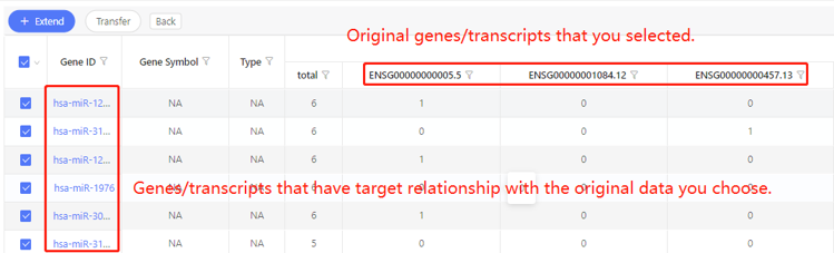
Based on interaction – RNAplex
Introduction:
Predict relationship between RNAs using RNAplex software.
Reference:
Tafer H, Hofacker IL. RNAplex: a fast tool for RNA-RNA interaction search. Bioinformatics. 2008 Nov 15;24(22):2657-63. doi: 10.1093/bioinformatics/btn193.
Parameters:
- Max MFE: from negative infinity to 0. The smaller the MFE, the closer the RNA relationship may be.
- Max num: The maximum number of genes/transcripts that can be called.
- Limit: set the maximum number.
- No limit: don’t have to set the maximum number.
Example:
First row shows the original genes/transcripts you selected. Genes/transcripts that are predicted to have relationship with the original data are shown in the first column. In the table, ‘1’ represents the corresponding data have relationship, ‘0’ represents they don’t. Dr. Tom system displays 20 genes/transcripts in the first row by default. If there are more than 20 genes/transcripts, you can download the table to check the hidden part.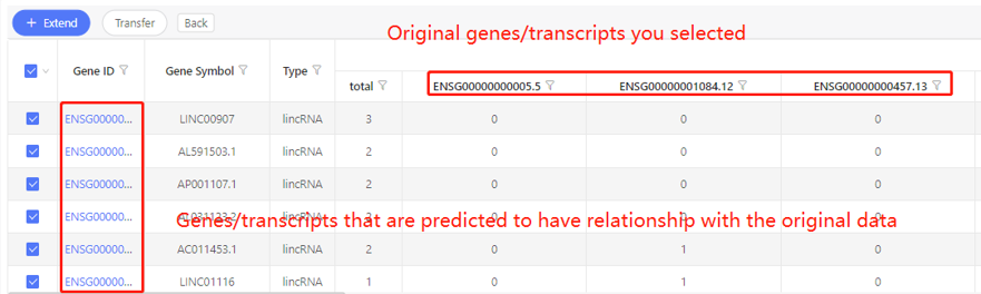
Based on interaction – GGI
Introduction:
Predict relationship between genes (only for human and mouse).
Method:
Text mining was performed with machine learning algorithms to identify and label related genes in NCBI PubMed database. According to the statistics of the human test data set, the precession and recall rate are both above 80%.
Parameters:
- Min score: from 1 to 586. The higher the score, the stronger the correlation may be.
- Max num: The maximum number of genes that can be called.
- Limit: set the maximum number.
- No limit: don’t have to set the maximum number.
Example:
First row shows the original genes you selected. Genes that are predicted to have correlation with the original data are shown in the first column. In the table, ‘1’ represents the corresponding data have correlation, ‘0’ represents they don’t. Dr. Tom system displays 20 genes in the first row by default. If there are more than 20 genes, you can download the table to check the hidden part.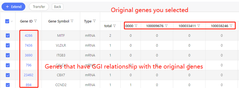
Based on interaction- ceRNA
Introduction:
Predict ceRNA of selected mRNA/lncRNA. Only for human and mouse temporarily.
Method:
- Obtain the matrix of RNAx and RNAy (RNAx, RNAy refer to a pair of targets in the relationship, respectively) according to the target relationship, and calculate the significance P value and Q value according to the number of shared miRNAs, the number of targeted miRNAs of RNAx and RNAy, and the number of all miRNAs.
- Calculated the ratio of shared miRNAs between RNAy and RNAx (number of shared miRNAs / number of targeted miRNAs of RNAx) and retained the top 10% pair.
- Calculate the score according to the Qvalue
Q value=10-2~1,score = -log(Qvalue)*44
Q value=10-12~10-2,score =88 + (-log(Qvalue))
Q value=0~10-12,score=100
Parameters:
- Min score: from 0 to 100. The higher the score, the more reliable the ceRNA may be.
- Max num: The maximum number of genes that can be called.
- Limit: set the maximum number.
- No limit: don’t have to set the maximum number.
Example:
First row shows the original genes you selected. Genes that are predicted to be ceRNA of the original data are shown in the first column. In the table, ‘1’ represents the corresponding data have ceRNA relationship, ‘0’ represents they don’t. Dr. Tom system displays 20 genes in the first row by default. If there are more than 20 genes, you can download the table to check the hidden part.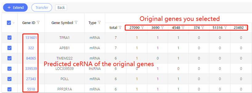
Based on position
Introduction:
Find the genes/transcripts that are positionally related to the selected genes/transcripts. Users can adjust the upstream/downstream range and show the gene/transcripts on sense/antisense/both strands.
Example:
First row shows the original genes you selected. Genes that have specific positional relationship with the original genes are shown in the first column. In the table, ‘1’ represents the corresponding data have positional relationship, ‘0’ represents they don’t. Dr. Tom system displays 20 genes in the first row by default. If there are more than 20 genes, you can download the table to check the hidden part.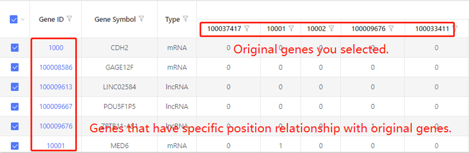
Based on position - DMR to gene/transcript
Introduction:
Find the genes/transcripts that are positionally related to the selected DMRs. Users can adjust the upstream/downstream range.
Example:
First row shows the original genes you selected. Genes that have specific positional relationship with the original genes are shown in the first column. In the table, ‘1’ represents the corresponding data have positional relationship, ‘0’ represents they don’t. Dr. Tom system displays 20 genes in the first row by default. If there are more than 20 genes, you can download the table to check the hidden part.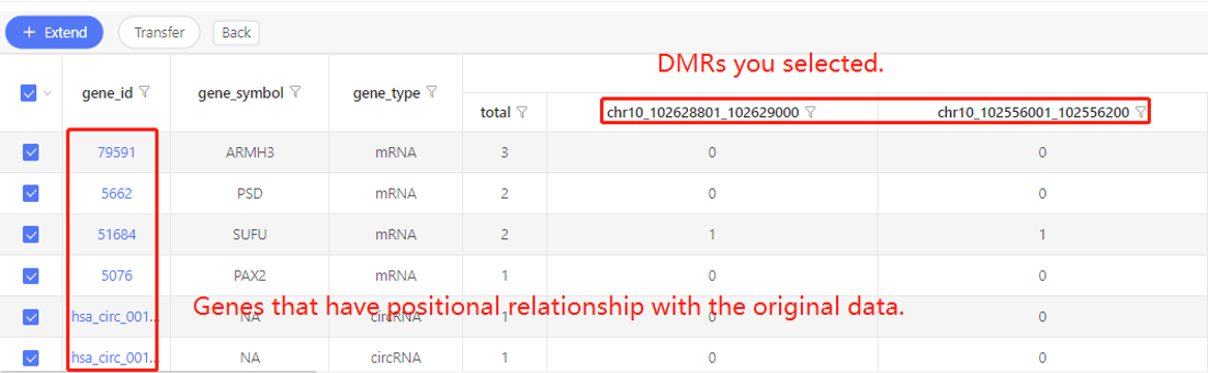
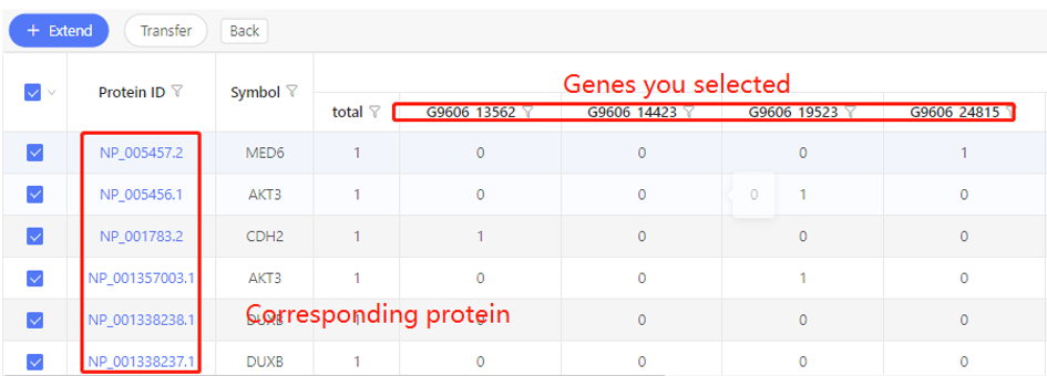
Based on mapping - gene/transcript to protein
Introduction:
Find the corresponding proteins of the selected genes/transcripts.
Example:
First row shows the original genes you selected. Corresponding proteins are shown in the first column. In the table, ‘1’ represents the corresponding relationship, ‘0’ represents they have no relationship. Dr. Tom system displays 20 genes in the first row by default. If there are more than 20 genes, you can download the table to check the hidden part.
Based on mapping - cell to gene
Introduction:
Find the genes detected in the chosen cells.
Parameters:
Expression: set the threshold of expression. Only find out the genes whose expression is above this threshold.
Example:
First row shows the original cells you selected. Corresponding genes are shown in the first column. In the table, numbers represent the expression. Dr. Tom system displays 20 cells in the first row by default. If there are more than 20 cells, you can download the table to check the hidden part.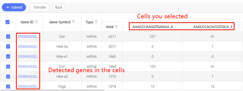
Based on mapping - gene to cell
Introduction:
Find the cells in which the selected genes were detected.
Parameters:
- Select sample: Choose one sample in which the cells are identified
- Expression: set the threshold of expression. Only find out the cells in which the gene expression is above this threshold.
Example:
First row shows the original genes you selected. Corresponding cells are shown in the first column. In the table, numbers represent the expression. Dr. Tom system displays 20 cells in the first row by default. If there are more than 20 cells, you can download the table to check the hidden part.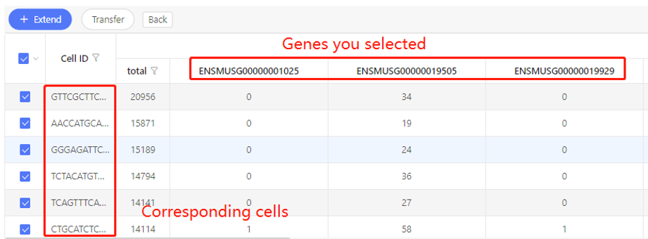
Enrichment
Introduction:
use different database (KEGG pathway, GO, etc.) to do enrichment analysis, to help understand which metabolic pathways and biological processes the selected genes are enriched in.
Principle:
Enrichment analysis uses hypergeometric test to find out the pathways/functions that are significantly enriched in candidate genes compared with all gene backgrounds.
Software:
R-phyper
Database introduction:
- KEGG pathway: a collection of manually drawn pathway maps representing our knowledge of the molecular interaction, reaction and relation networks for Metabolism, Genetic Information Processing, Environmental Information Processing, Cellular Processes, Organismal Systems, Human Diseases and Drug Development.
- GO: The Gene Ontology resource provides a computational representation of our current scientific knowledge about the functions of genes (or, more properly, the protein and non-coding RNA molecules produced by genes) from many different organisms, from humans to bacteria. It is widely used to support scientific research, and has been cited in tens of thousands of publications. The Gene Ontology (GO) describes our knowledge of the biological domain with respect to three aspects: Molecular Function, Cellular Component and Biological Process.
- MSigDB: The Molecular Signatures Database (MSigDB: http://www.gsea-msigdb.org/gsea/msigdb) is a collection of annotated gene sets of human for use with GSEA software, which is divided into 9 major collections:
- H: hallmark gene sets
- C1: positional gene sets
- C2: curated gene sets
- C3: motif gene sets
- C4: computational gene sets
- C5: GO gene sets:Gene Ontology
- C6: oncogenic signatures
- C7: immunologic signatures
- Transcription Factor: For plants, the transcription factor information comes from PlantTFDB v5.0. For animal, the transcription factor and cofactor information come from AnimalTFDB v3.0.
- Pfam: a large collection of protein families, each represented by multiple sequence alignments and hidden Markov models (HMMs).
- Reactome: a free, open-source, curated and peer-reviewed pathway database.
- COG: a database developed by NCBI for homologous protein annotation. It is constructed by classifying the encoded proteins of 21 complete genomes of bacteria, algae and eukaryotes according to the phylogenetic relationship. The function of the protein can be well predicted by the alignment of the identified protein with the database.
- EggNOG: maintained by EMBL. It is an extension of NCBI's COG database to provide Orthologous Groups (OG) of proteins at different taxonomic levels, including eukaryotic, prokaryotic and viral data information.
- InterPro: a resource that provides functional analysis of protein sequences by classifying them into families and predicting the presence of domains and important sites.
Case Demo: (KEGG pathway enrichment)
The table shows the pathways the selected genes are enriched in. By default, the graph shows the top 20 pathways sorted by q-value from small to large.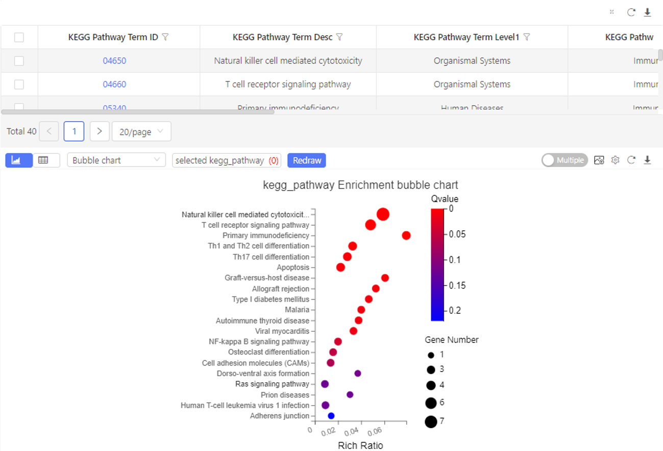
GSEA Enrichment
Introduction:
a computational method that determines whether an a priori defined set of genes shows statistically significant, concordant differences between two biological states.
Methods:
https://www.gsea-msigdb.org/gsea/index.jsp
Parameters:
- Filtering threshold
- Max size (exclude larger sets):the maximum number of genes included in a pathway
- Min size (exclude smaller sets):the minimum number of genes included in a pathway
Case Demo:
The table shows the number of genes, enrichment score, nominal P-value etc. of each gene set. The graph shows the GSEA enrichment result. Dr. Tom system only displays the top 100 gene sets according to the standardized enrichment score.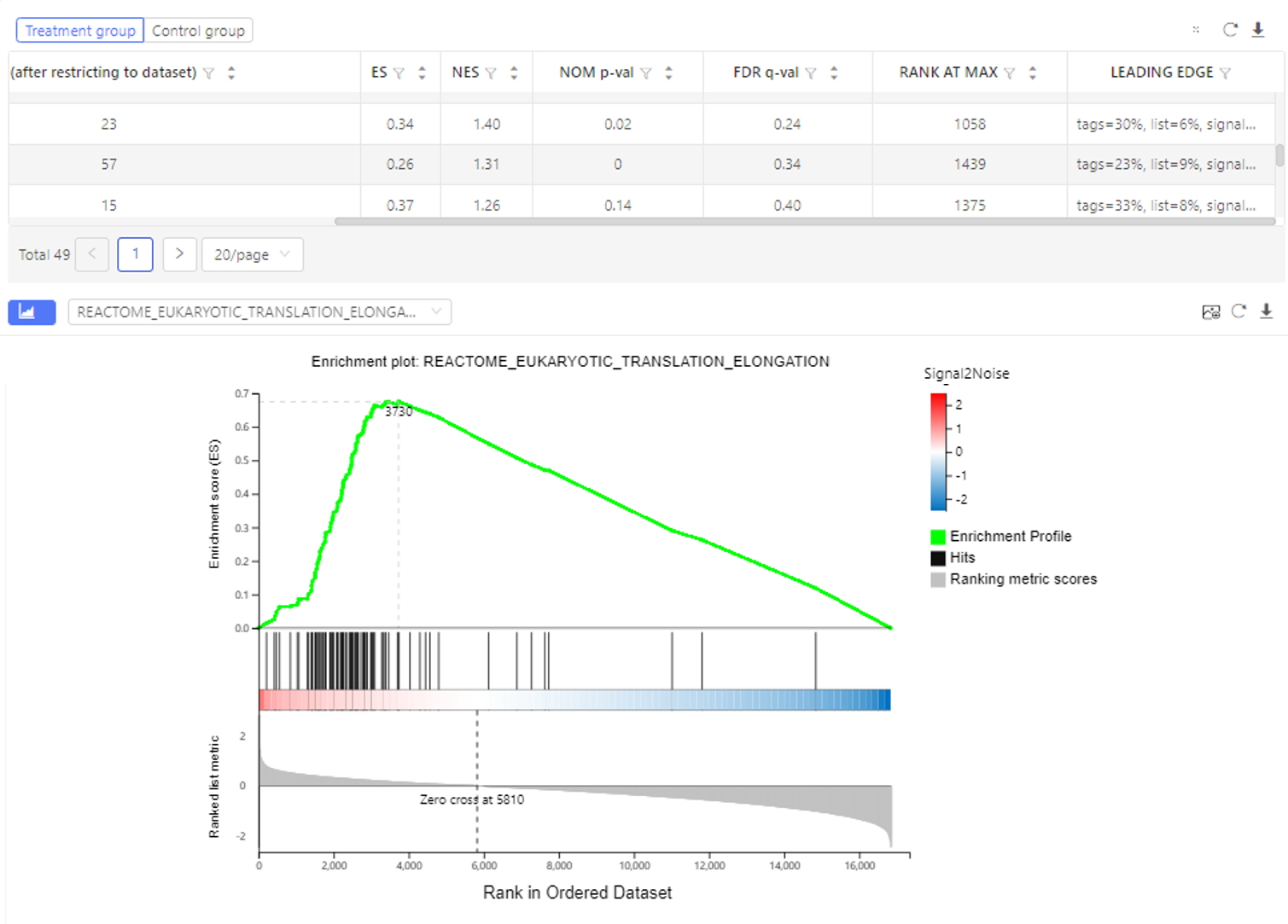
Classification
Introduction:
Sort the selected genes according to annotations in different database, and plot a bar chart.
Case Demo: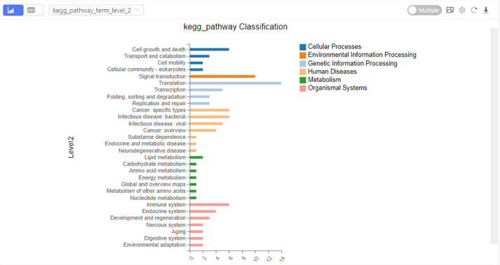
Heatmap
Introduction:
plot the expression, log2FC or customized data in a heatmap to see the clustering of genes/transcripts/proteins.
Case Demo:
An expression heatmap. Gene symbol/ID, other classification information can be added through graph setting.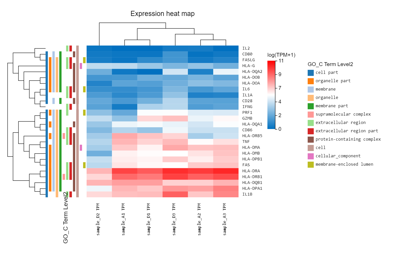
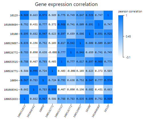
Gene Correlation
Introduction:
Use TPM/FPKM/Read count of selected genes to calculate Pearson or Spearman correlation coefficient, plot a gene correlation heatmap.
Case Demo:
gene correlation
Sample Correlation
Introduction:
Use TPM/FPKM/Read count of selected genes to calculate Pearson or Spearman correlation coefficient, plot a sample correlation heatmap.
Case Demo: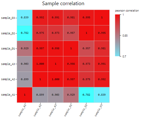
Difference Analysis
Introduction:
Customized differential expression genes analysis between two samples/groups. Displayed the result in bar chart.
Software:
- DESeq2:only for case with biological samples
Reference: Love, M.I., Huber, W. & Anders, S. Moderated estimation of fold change and dispersion for RNA-seq data with DESeq2. Genome Biol 15, 550 (2014). https://doi.org/10.1186/s13059-014-0550-8 - DEGseq: for case with or without biological samples
Reference: Wang L, Feng Z, Wang X, Wang X, Zhang X. DEGseq: an R package for identifying differentially expressed genes from RNA-seq data. Bioinformatics. 2010 Jan 1;26(1):136-8. doi: 10.1093/bioinformatics/btp612. - edgeR: only for case with biological samples
Reference: Mark D. Robinson, Davis J. McCarthy, Gordon K. Smyth, edgeR: a Bioconductor package for differential expression analysis of digital gene expression data, Bioinformatics, Volume 26, Issue 1, 1 January 2010, Pages 139–140, https://doi.org/10.1093/bioinformatics/btp616 - PossionDis: only for case without biological samples
Reference: Audic, S. and J. M. Claverie. (1997). The significance of digital gene expression profiles. Genome Res, 10: 986-95.
Case Demo: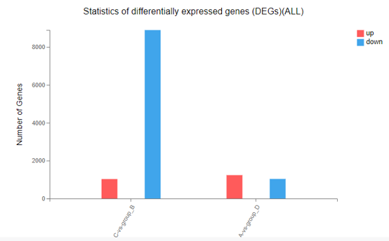
Network
Introduction:
Draw a network plot to display PPI/target/ceRNA/RNAplex/GGI relationship between genes/transcripts/proteins.
Parameters explanation:
Please refer to Transfer part.
Case Demo:
Color of lines represents different relationship. Different symbols represent different RNA type, of which the size and the color represent the linkage number.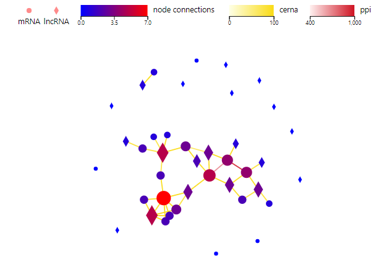
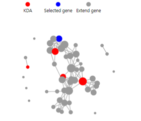
KDA
Introduction:
Key driver gene analysis, which helps to understand the genes that are the main regulators of the selected genes.
Parameters explanation:
- Key genes: Set the number of key genes
- Extend genes: Set the number of correlated genes
- Score: The score from STRING11 database. Ranged from 400 to 1000. The higher the score, the more likely the relationship is to be accurate.
Case Demo:
KDA
KEGG Network
Introduction:
Draw a network plot to display relationship between selected genes and KEGG pathways.
Case Demo:
Color of the squares (representing KEGG pathways) and circles (representing mRNA/proteins) stands for the connection number by default. Color of the connection link represents different categories of KEGG pathways.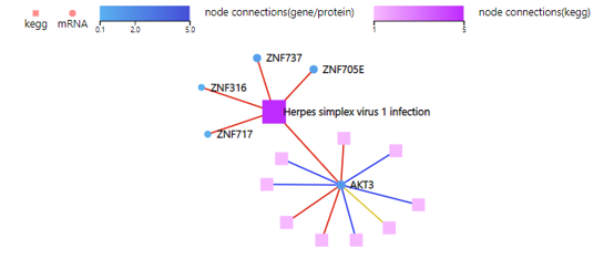
WGCNA
Introduction:
Weighted gene co-expression network analysis, clustering genes with similar expression patterns, and analyzing the association between modules and specific samples (phenotypes) and display it in a heat map. At least 15 samples should be included in WGCNA according to the official recommendation.
Case Demo:
Different color box on the vertical axis represents different gene modules. Numerical characters in the heatmap represent Pearson value and P-value.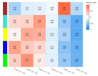
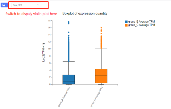
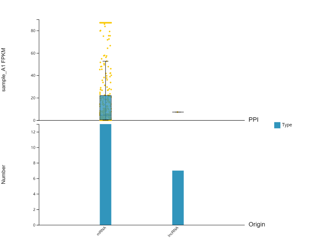
Boxplot
Introduction:
Boxplot or violin plot to display the gene expression, fold change or customized data in different samples.
Case Demo:BOXPLOT
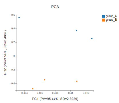
PCA
Introduction:
Principal components analysis, which reduces the dimension of the data set and extracts the features that contribute the most to the variance in the data set.
Method:
R package-function princomp
Case Demo:
PCA
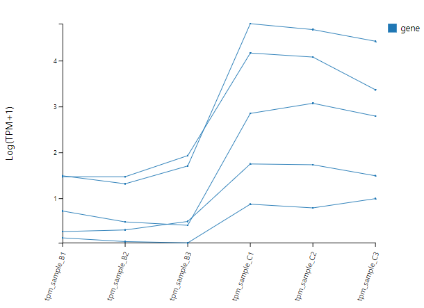
Line Chart
Introduction:
Select genes and draw a line chart using gene expression, fold change or custom data.
Case Demo:
LINE
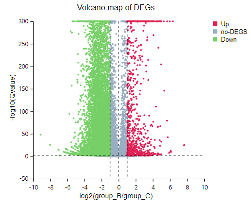
Volcano Plot
Introduction:
Demonstrate fold change and Q-value of expressed genes in a specific comparison groups in a volcano plot.
Case Demo:
volcano
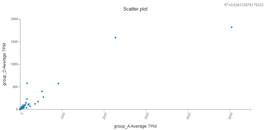
Scatter Plot
Introduction:
Select two columns of numeric data and draw a scatter plot to help understand the correlation between them.
Case Demo:
Association Network
Introduction:
Draw a network plot after the ‘Transfer-based on interaction’ function to display the relationship.
Parameters:
Please refer to Transfer-based on interacion-PPI/Targe/ceRNA/RNAplex/GGI.
Case Demo: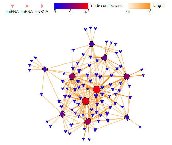
Multi-omics Association
Introduction:
Plot categorical histograms, expression boxplots, etc. of the current gene or genes extended by PPI, miRNA target relationship, etc.
Case Demo:
In the setting part, you can choose to add the expression box plot of certain genes.
Multi-omics Correlation
Introduction:
Calculate the correlation between two sets of data, for example, the correlation of miRNA and its target gene calculated by the expression in a set of samples.
Parameters:
- Relation: Please refer to ‘Transfer-based on interaction- PPI/Targe/ceRNA/RNAplex/GGI’.
Select sample: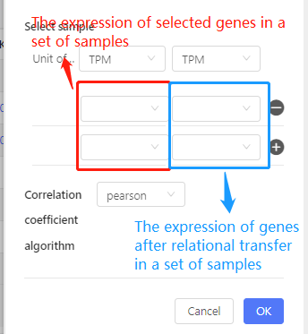
Case Demo:
The upper table shows the expression and the correlation coefficient. The graph below shows the number of genes corresponding to each correlation coefficient interval.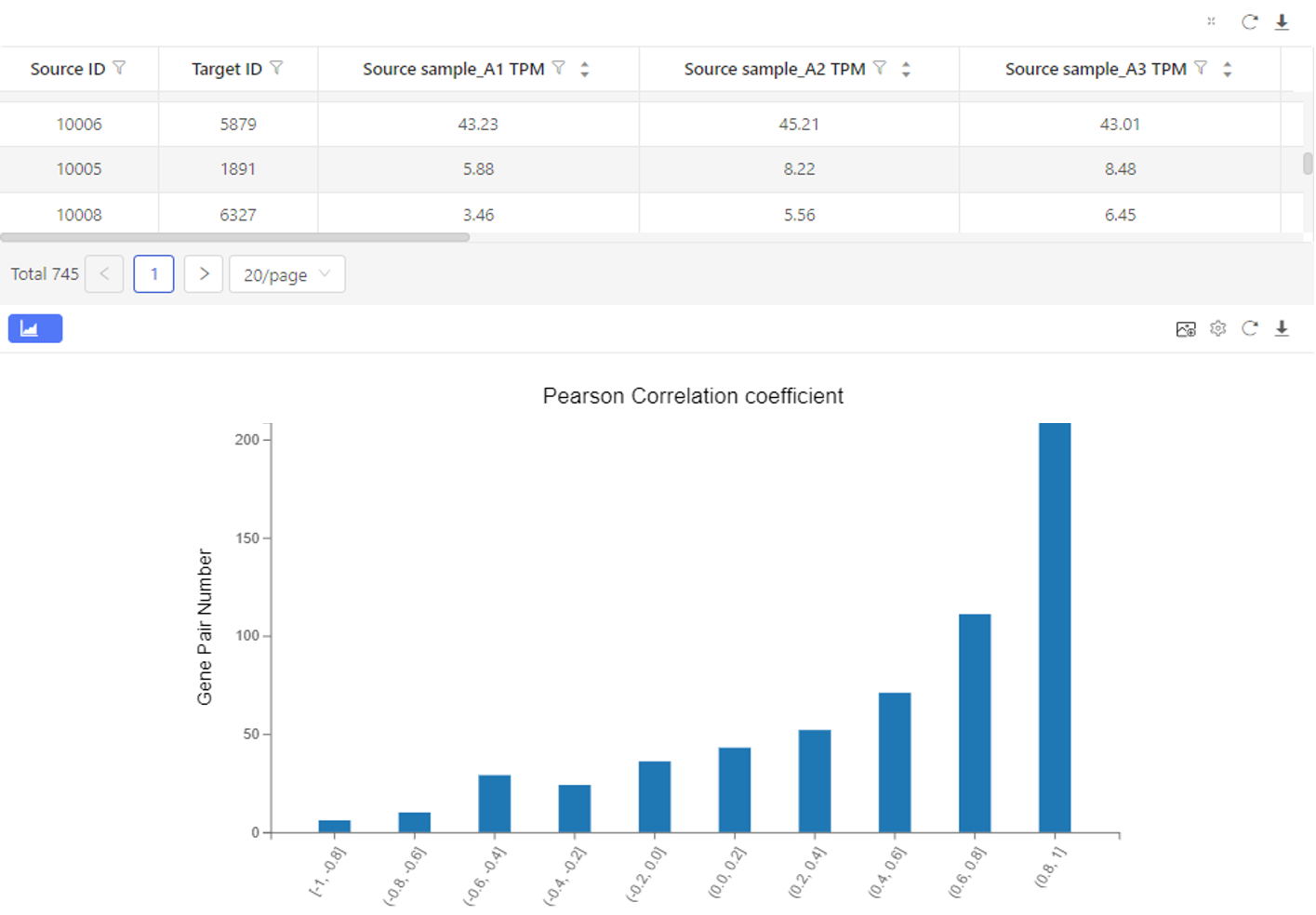
Single cell- Difference analysis
Introduction:
Detect differentially expressed genes between two cell sets. Users can choose to compare by cell types, samples or customized cell sets.
Case Demo: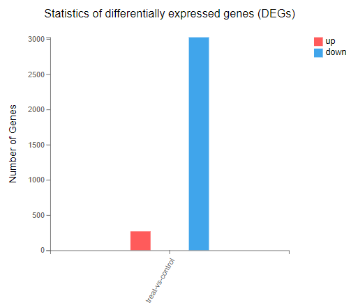
Single cell- Cell clustering
Introduction:
Select cells and perform cell clustering analysis. Clustering results, cell annotation, marker genes identification will be obtained.
Software:
Seurat
Cell annotation database:
- CellMarker: a comprehensive and accurate resource of cell markers for various cell types in tissues of human and mouse, in which 4,124 entries including the cell marker information, tissue type, cell type, cancer information and source, were recorded.
- CancerSEA: database that decodes distinct functional states of cancer cells at single-cell resolution, which provides a cancer single-cell functional state atlas, involving 14 functional states of 41,900 cancer single cells from 25 cancer types.
Case Demo:
Overview – Basic information of the cell clustering results.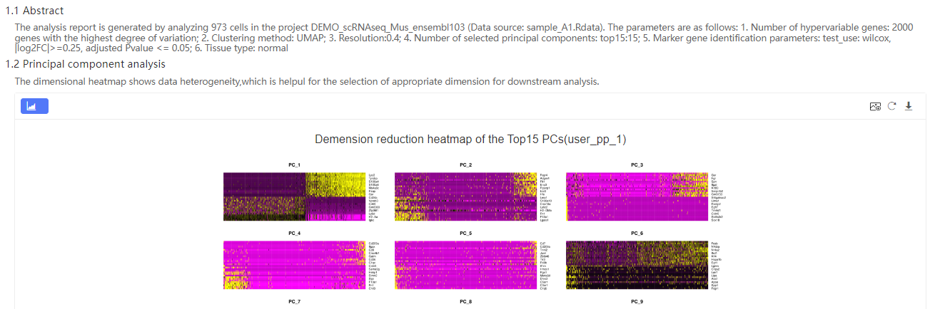
High variable feature selection – display the average expression and standardized variance to help screen out high variable genes.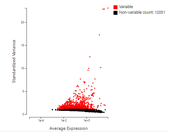
Pattern of marker gene expression - Display the expression bubble chart of the top 2 marker genes of each cluster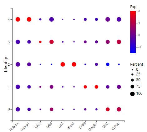
Marker gene – number of marker genes of each cluster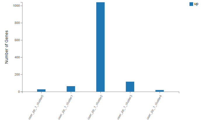
Cell gene number – gene number of each type of cells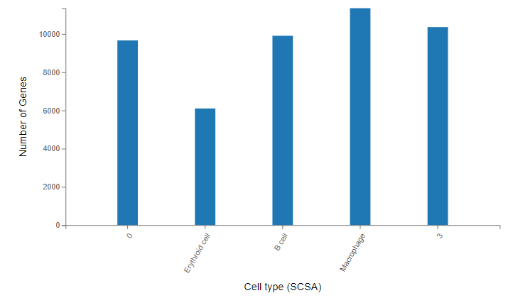
Cell clustering plot – Cell clustering and annotation results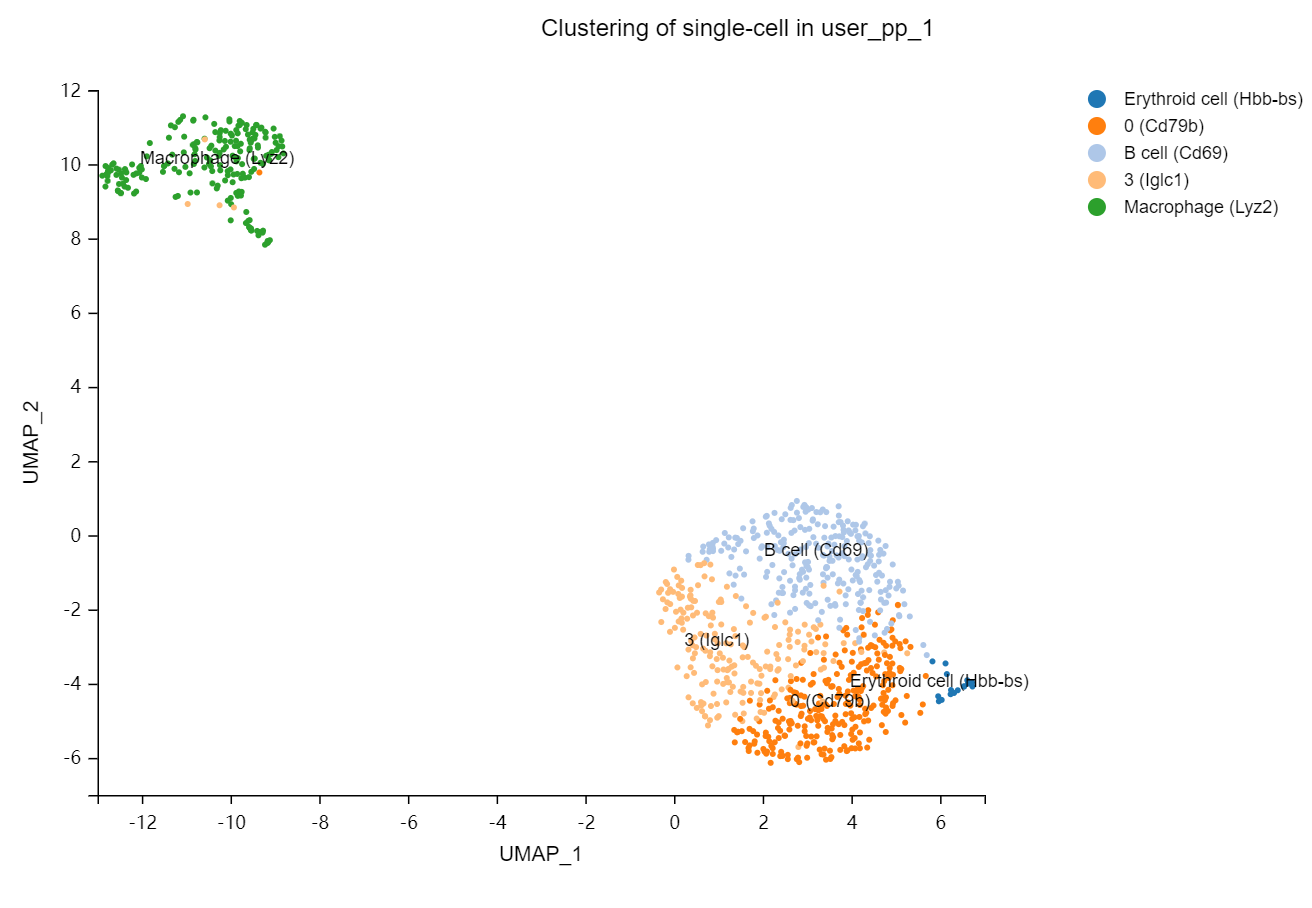
Single cell- Cell annotation
Introduction:
Perform cell annotation. SCSA, SciBet and singleR can be chosen. For SCSA, Dr. Tom supports users to upload customized annotation database to do cell annotation.
Software:
- SCSA: an automatic tool to annotate cell types from single-cell RNA-seq data, based on a score annotation model combining differentially expressed genes and confidence levels of cell markers in databases. https://github.com/bioinfo-ibms-pumc/SCSA
- SingleR: a computational method for unbiased cell type recognition of scRNA-seq. https://bioconductor.org/packages/release/bioc/html/SingleR.html
- SciBet: a computational tool for predicting cell identity for any randomly sequenced cell by single cell RNA sequencing technique. Compared to other supervised cell type identification methods, SciBet achieves advantages in accuracy, robustness, scalability and especially in speed. http://scibet.cancer-pku.cn/
Database:
SCSA:
CellMarker: a comprehensive and accurate resource of cell markers for various cell types in tissues of human and mouse, in which 4,124 entries including the cell marker information, tissue type, cell type, cancer information and source, were recorded.
CancerSEA: database that decodes distinct functional states of cancer cells at single-cell resolution, which provides a cancer single-cell functional state atlas, involving 14 functional states of 41,900 cancer single cells from 25 cancer types.
Sketched-based analysis: When the number of cells is large, Seurat supports sampling (sketch) of cells before clustering. Official algorithm can be checked here: https://satijalab.org/seurat/articles/seurat5_sketch_analysis
SingleR:
Eight reference databases.
For human:
- BlueprintEncodeData: consists of bulk RNA-seq data for pure stroma and immune cells generated by Blueprint and ENCODE projects (The ENCODE Project Consortium2012).
- DatabaseImmuneCellExpressionData: consists of bulk RNA-seq samples of sorted cell populations from the project of the same name
- HumanPrimaryCellAtlasData: consists of publicly available microarray datasets derived from human primary cells. Most of the labels refer to blood subpopulations but cell types from other tissues are also available.
- MonacoImmuneData: consists of bulk RNA-seq samples of sorted immune cell populations from GSE107011
- NovershternHematopoieticData: consists of microarray datasets for sorted hematopoietic cell populations from GSE24759
For mouse:
- ImmGenData: consists of microarray profiles of pure mouse immune cells from the project of the same name.
- MouseRNAseqData: consists of a collection of mouse bulk RNA-seqdata sets downloaded from the gene expression omnibus. A variety of cell types are available, mostly from blood but also covering several other tissues.
SciBet: About 90 databases are offered on Dr.Tom. See Detail
Case Demo:
Single cell - Pseudo-time analysis
Introduction:
Perform pseudo-time analysis of selected cell set. By analyzing the expression patterns of key genes in each cell, the related cells are arranged on the pseudo timeline in a certain order to simulate the cell differentiation process during development.
Case Demo:
Pseudotime overview – pseudotime scatter plot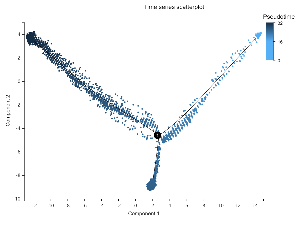
Branch expression heatmap – Display the expression heatmap of the top 50 genes with the highest difference in the selected branch or the selected genes.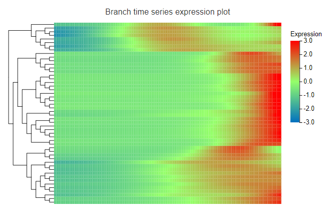
Gene expression scatter plot – Display the expression of the selected gene in different timepoint.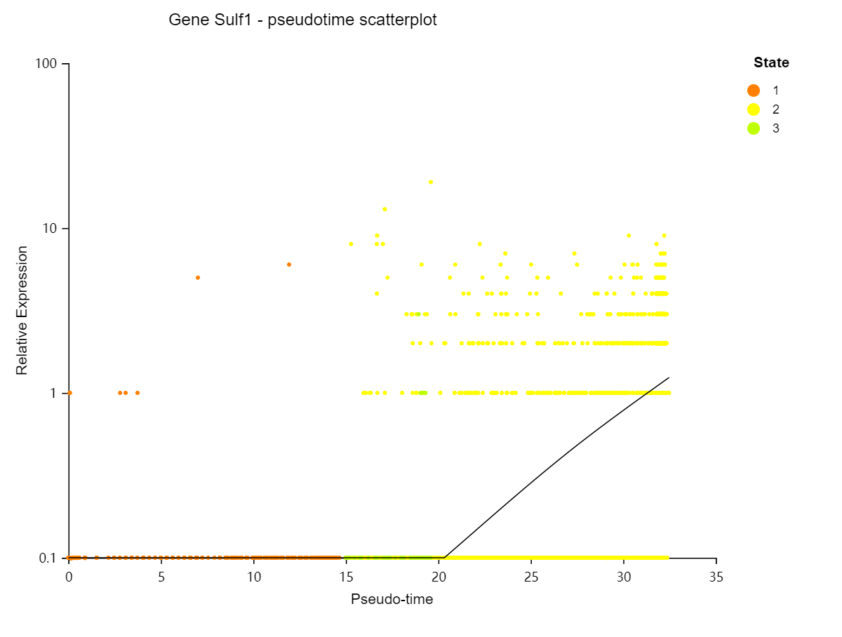
Single cell- Boxplot
Introduction:
Display the expression boxplot/violin plot of selected genes in different clusters/samples/cells/state. Mitochondrial percentage, total gene number, total UMI counts for cells and other custom data can also be displayed.
Case Demo: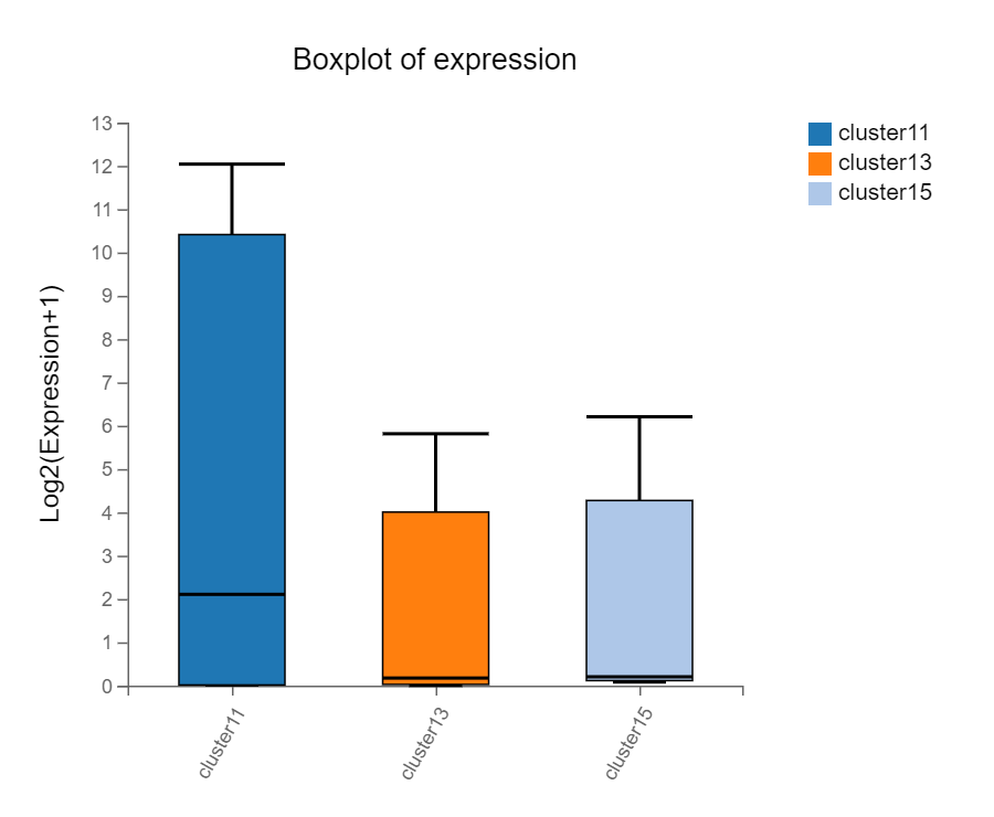
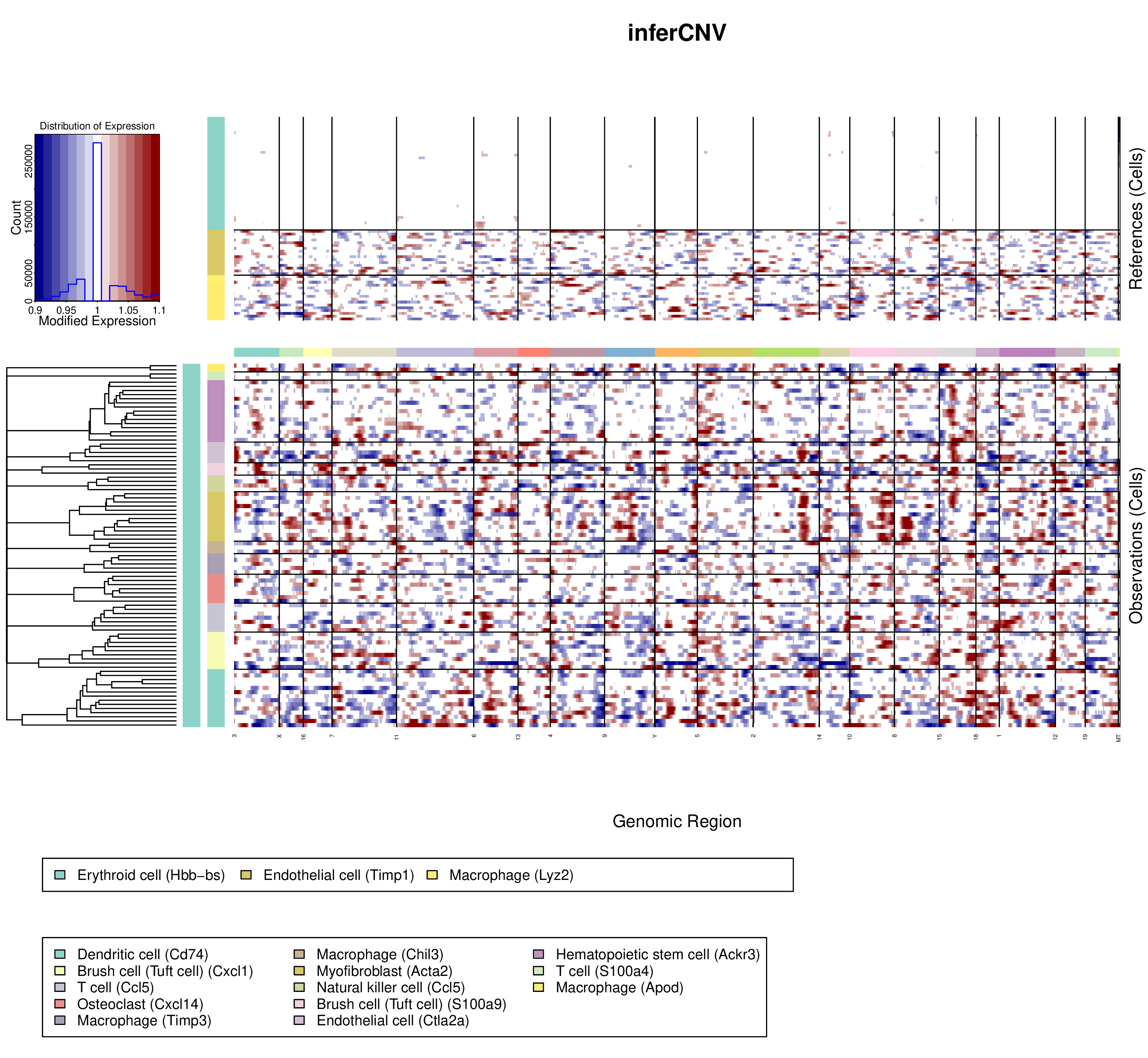
Single cell- CNV analysis
Introduction:
Perform CNV analysis of selected cells.
Parameters:
- Cell annotation: Use cluster or cell type to classified cells. Note that there should be at least 2 cells per cluster/cell type.
- Cell reference: Choose the reference cells (normal cells).
- Cluster by groups: Choose ‘Yes’, the dendrogram on the left is a 'linear concatenation' of the dendrograms for each type of non-reference cells (the root of the dendrogram is linked to the root of each type's dendrogram, which leads to having all of them on the same level). Choose ‘No’, the dendrogram on the left is a hierarchical clustering of all non-reference cells.
- Enables de-noising proceed: reduce the noise while retaining the signal in tumor cells that could be interpreted as supporting CNV
- Enables CNV predictions: Choose ‘Yes’, Dr. Tom will use i6 HMM model to predict CNV. Choose ‘No’, Dr. Tom will not use HMM model to predict CNV.
Case Demo:
Top left: The abscissa is the range of the average expression change, and the ordinate is the P value;
Heatmap:
- The upper part represents the reference cells. The below part represents observed cells.
- Vertical axis is clustered by cell type/cluster;
- The first column of color box represents the clusters of cells, the default parameter is 1;
- The second column of color boxes represents different cell types/clusters.
- The color box on the horizontal axis represents different chromosomes.